Manzanita Art Gallery Website
This project is a prototype for a fictional art gallery responsive website that includes an online ticket purchasing flow.
Project Overview
The product:
A responsive website featuring a ticket ordering flow for the Manzanita Art Gallery.
Project duration:
August - September 2022
The problem:
The only way to get tickets for exhibitions at this art gallery was to go in person and wait in line to buy tickets.
The goal:
The only way to get tickets for exhibitions at this art gallery was to go in person
and wait in line to buy tickets.
My role and responsibilities:
Researcher and Designer. User research, wire-framing, prototyping & final mockups.
User Research
Summary
My first step was to visit other websites that have ticket purchasing systems and made a list of features that are necessary for the flow. I then took notes of how these sites implemented the features and which ones I found the most useful or not. I also looked into different payment options to make things as easier for as many people as possible.
Pain Points
Easy Checkout
Need different payment options so checkout can be as easy as possible.
Openings
Need an easy way to view which dates and times are still available.
Design
Something that is pleasant to look at and easy to flow through.
Personas
Janet
Problem statement:
Janet is a mother and teacher who loves to go to the art gallery, who needs an easy way to purchase tickets for upcoming exhibits online because it’s hard to find time to go in person and wait in line for tickets.
Ben
Problem statement:
Ben is a busy graphic designer who likes to keep up on art trends but has a hard time finding time to wait in line for tickets and when he doesn’t they usually sell out.
User Journey Map
This user journey map shows how much easier it would be to just go online to buy tickets vs. in person.
Starting the Design
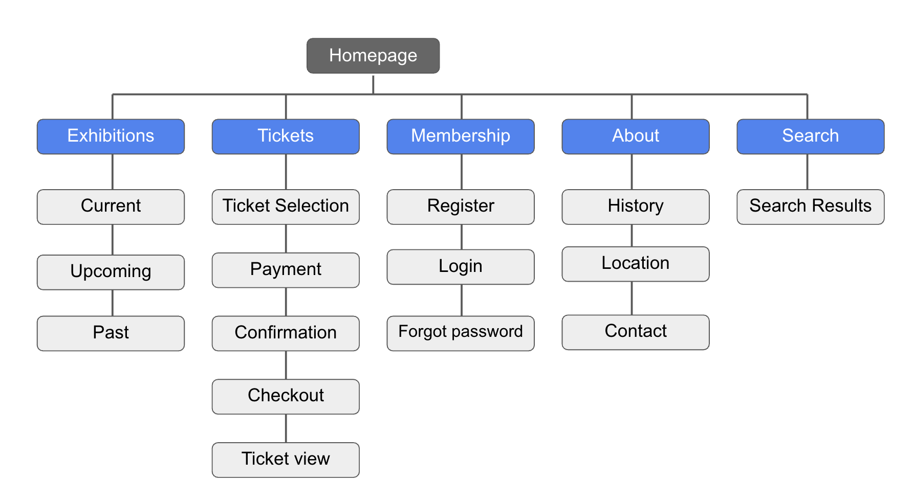
Sitemap
My goal was to make a easy to navigate website for an art gallery with a ticketing flow. The sitemap I came up with seemed to be a good option for this project.
Paper Wireframes
After looking at other successful websites I put a few different paper wireframes together to figure out what layouts might work best.
Screen Size Variations
After finalizing a wireframe I was happy with I then made mobile and ipad size version of the layouts.
Digital Wireframes
This is the wireframe for the ticket select screen based on what I ended up on with the paper wireframe.
This is the digital wireframe I came up with for the ticket select screen. I ended up changing it a bit in later variations for ease of use.
Low-Fidelity Prototype
Here is a map of the lofi prototype for the desktop and mobile sites.
https://xd.adobe.com/view/4b08daf5-232a-4114-bcbe-aa55bd2b17fd-1e5b/?fullscreen
Usability Study Findings
In the usability test I discovered a few areas that could be improved on.
Usability Study Parameters
Study Type:
Unmoderated usability study
Location:
United State, Remote
Participants:
5 Participants - 3 Men 2 Women
Length:
20-30 Minutes
Logo to Home
Users wanted the logo to bring them to the home screen.
Cart Drop Down
Instead of loading a new page users wanted the cart button to be a drop down overlay
Refining the Design
Mockups
Mockups: Desktop
Went from a separate page for the cart to a drop down overlay.
Mockups: Mobile
High-Fidelity Prototypes
Mobile prototype:
https://xd.adobe.com/view/942f4e9a-2462-4df6-b139-439fc4ba61dd-c17c/
Accessibility Considerations
Colors
I used accessible friendly coloring for easy reading and making sure important things stand out with color.
Payment Options
Added many payment options for easier check out.
Text Size
I used headings with different sized text for clear visual hierarchy
Going Forward
Takeaways
Impact:
Having an easy to navigate website and ticket purchasing flow is really convenient for the patrons and the gallery itself. Saves everyone time and headache.
What I learned:
I learned that sometimes simple is best and little design elements can go a very long ways in terms of navigation.
Next Steps
First
Conduct another useability test on the desktop and mobile version.
Second
Figure out what else could be improved or added.
Third
Update design accordingly.
Thank you for viewing my case study for MAG!


